
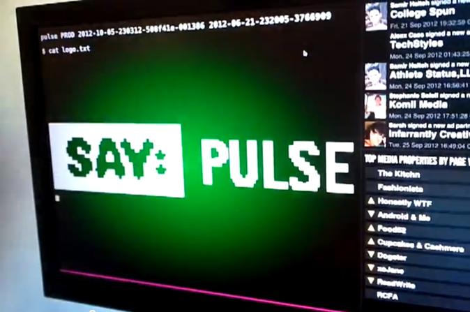
Say Pulse is part status board, part dashboard, and part content feed. It was convieved as part of a Say Media hackathon as a way to show interesting data across the growing company and draw people's attention to things that they might not naturally hear about in their day-to-day.
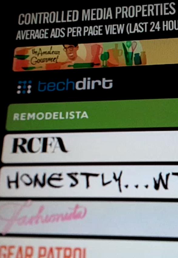
Pulse has grown since the hackathon to show a variety of interesting data visualizations along with photos from recent social events, content from Say Media's magazine sites, employee profiles and more.
The Technology
Say Pulse is entirely built on web technologies, but it isn't your average web app. Since it is non-interactive, all forward progress happens automatically. It is deployed around the Say Media offices via a screen saver based on WebKit, and so it makes use of the latest WebKit features such as CSS transitions, 3D transforms and SVG graphics.
The main portion of the screen is devoted to a randomly-cycling "main frame", that can show anything in any visualization we desire. Behind the scenes the main frame is simply an iframe with a simple API exposed into it to allow the frame implementation to coordinate with the rest of the framework.
To ensure smooth transitions between frames, each frame has a simple three-step lifecycle: first the framework loads the content into an off-screen iframe and waits for it to signal that it is ready via a callback. The current frame then runs to completion before the framework swaps out the visible frames and signals the new frame to begin its animation. While the new frame is animating, the framework prepares the next. At the end of its run, the visible frame is signalled to terminate after which it gets a short period to do some kind of transition to black before we show the next.
Since the progression is completely unattended, it's important that the system is resilient to temporary outages and other bugs that might otherwise halt its progress. Using iframes is one way to achieve this: the management of the "playlist" and transition timing is logically separated from the visualization implementation.
Along with this, a frame loading in the background gets given five seconds to signal readiness before the controller gives up on it and tries the next frame. This ensures that if the data source needed by one of the frames is temporarily unavailable then we'll just skip over that frame without any visible glitches. In the worst case, where none of the frames seem to be able to load, Pulse will retain the last visible frame on-screen for an extended period to hide the fault; most of the frames are designed to leave at least something onscreen until they recieve the end signal, so we are rarely left with a blank screen in this case.
Building Pulse
For me Pulse was actually one in a series of attempts to build status boards. At Six Apart we went through several iterations of Status Boards with different levels of focus: sometimes just TypePad, other times the whole company, other times the Engineering team's broader concerns.
What made Pulse succeed where my previous attempts did not was in having a flexible framework that allows a variety of different presentations to coexist, and an emphasis on showing interesting rather than actionable information: there's certain data that people need to do their jobs, and that data can be obtained by other means. Pulse, on the other hand, is intended to make people say "That's interesting; I didn't know that!". To help people learn a little about what other people do in their jobs. To help us see what's going on in the other offices with the people we can't see every day.
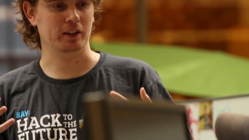
Pulse as a hackathon project was proposed by product manager Dusty Gronso. For the three-day hackathon I lead a team of colleagues Nathan Fair, Mike Shandrovskiy, Shane Dosch, Elaine Dunlap to build out what ended up being a prototype. That prototype got people excited enough that it won the "Best Overall Hack" prize, which inspired me to make it real.
Since then I've polished the prototype, implemented a larger set of content for it, and seen it deployed on screens in our offices all over the world. For me it's been a great opportunity to try all of the new web technology implemented in WebKit, without the usual worries of downstream compatibility. I'm also excited every time I see someone look at a Pulse screen, stroke their chin, and say something like "Wow, I didn't know that ReadWrite got so many page views."
The Big Rebrand of 2012
In October 2012 Say Media launched a complete rework of its corporate branding. Given the high visibility of Pulse in our office environment, and how strongly the previous branding standards were featured in Pulse's presentation, Pulse was one of the first things to get an overhaul.
I took the change as an opportunity to rethink some of Pulse's own design standards and as part of this work switched from the three-pane design from the first iteration to a simpler layout where the "main frame" takes the entire screen. As well as giving more screen real-estate for the main content, this also allowed Pulse to follow the lead of the branding effort and make its own branding more subtle, allowing Say Media's various content brands to take priority.
The rebranding work involved visual design changes to every single feature of Pulse, including the switch of corporate typeface, the change to the color scheme and logos, and the change in layout causing the main frames to now have a different aspect ratio.
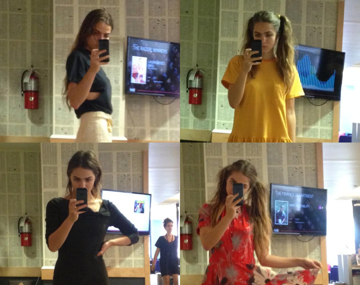
Photos from xoVain