
In June 2015 I wrote an article about improving San Francisco transit. In that article I imagined an alternative San Francisco with a world-class public transit system that is efficient and intuitive to riders, describing how it could be built in terms of the infrastructure already present.
Aside from the work in actually designing the system, which is reflected in the article itself, creating diagrams to illustrate the idea represented a significant part of the effort and was a great opportunity to do some more programmatic design.
Network Diagram
The focal point of the article was a diagram of the hypothetical system, created in the style of the London Underground network map. The creation of this diagram was an interesting adventure, combining diagramming tools, CAD visual design and even a bit of pen-and-paper sketching.
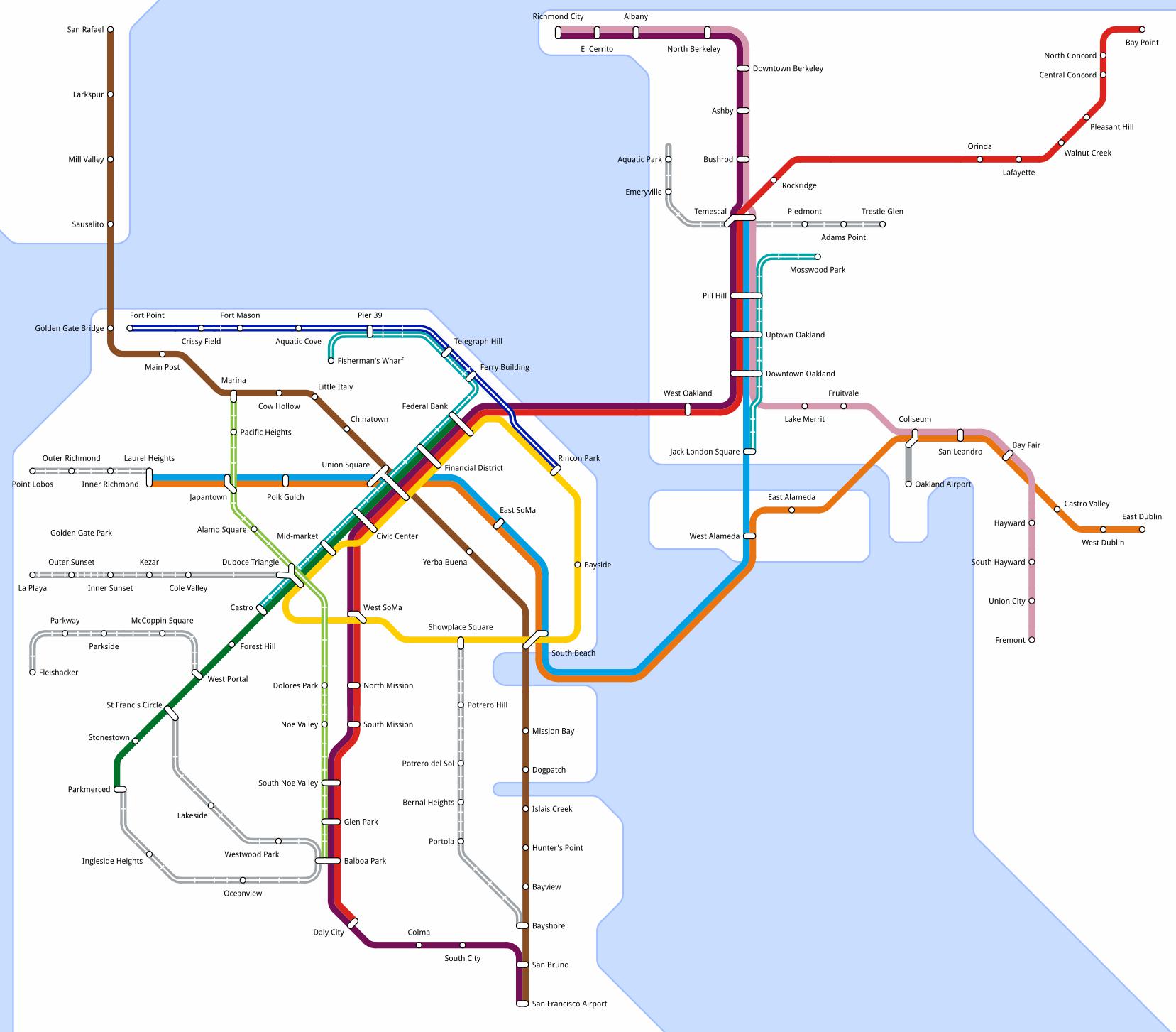
I expect that the people who make the official maps for transit agencies either use Adobe Illustrator or some specialized mapping tool, but as usual I wanted to create this entirely using open source tools.
I briefly considered drawing it all directly in Inkscape, but after some initial experimentation concluded that this would be far too fiddly and time-consuming. In particular, Inkscape has no support for automatically creating a curve between two lines, which is a key part of the tube map aesthetic.
On some of my "real-world hacking" projects I've used LibreCAD to create precise 2D designs, and I recalled that it has a tool for creating rounded corners at a particular radius. In LibreCAD this is called "round" but in other CAD tools it is called "fillet". After a few quick experiments with importing DXF files into Inkscape I decided that LibreCAD would be a reasonable tool with which to do the basic layout, after which I could finalize the presentation in Inkscape.
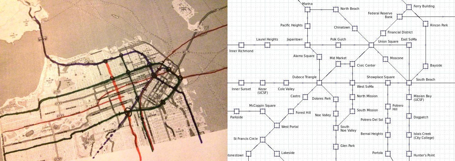
I didn't feel confident going directly to CAD though, since I knew I was going to need to take some big liberties with the geographical relationships between stations but didn't yet have a good sense of how that would play out. I did a couple of prototypes to figure out the appropriate station positions, starting with a hand sketch with marker pens on a printout of an OpenStreetMap rendering, and then a basic diagram using Dia.
While my initial plan had been to import my DXF file into Inkscape to apply the final styling to the geometry, after a few more trial runs I decided that finger-painting the styles would be error-prone and time consuming. My next thought was to use TileMill, which I'd previously used on my pedestrian map project, but it seemed ill-suited for a diagram like this which isn't geo-referenced.
Finally I settled on writing a small script which reads in the DXF and writes out an SVG file. I wrote this in Python after finding the existing libraries dxfgrabber and svgwrite, which sped up the process.
I settled on some conventions to use in the DXF file. For example, dashed lines in the CAD file map to hollow lines in the rendering, and stops and stations are represented by DXF blocks with specific names. After that, it was just a matter of drawing it all out.
I used a 2mm grid in LibreCAD, with a base curve radius of 4mm. Using 4mm as the basis made the curves nice and curvy. Where many lines curve at once, they have radii starting at 2mm and growing in 2mm increments each, causing them to all curve evenly. The snapping tools and precise measures in LibreCAD made it pretty easy to sketch out the basic network.
The "stylizer" script takes the DXF file saved from LibreCAD and does some straightforward transformations: the lines and arcs making up the route geometry get converted into SVG paths, the stops and stations become SVG symbols, and the coastline outlines (polylines in the DXF) become filled paths.
One downside of the separation of geometry from final styling was that it was hard to predict exactly where the station name labels would land in the final rendering. Some of the labels ended up in sub-optimal positions, but I accepted many of these flaws because I did not have an unlimited amount of time to spend on this project.
Geographical Line Maps
I had originally intended to include geographical line maps for many of the proposed lines, but after editing the article down (yes, it was originally even more verbose than it ended up) I decided that only the Yellow Line section would really need a special map rendering.
For this part I used some parts I'd previously put together for . In particular, I hacked up the OSM-to-CSV data extractor I'd written for that project, and used TileMill to render the final map.
For the map data itself I downloaded a segment of OpenStreetMap data covering the region of interest, and then used JOSM to alter the data file to describe my fictitious San Francisco, taking care not to upload the result back to the OpenStreetMap servers. Another Python script then extracted the relevant parts of the OSM export and wrote out a number of CSV files for TileMill to consume as input data.
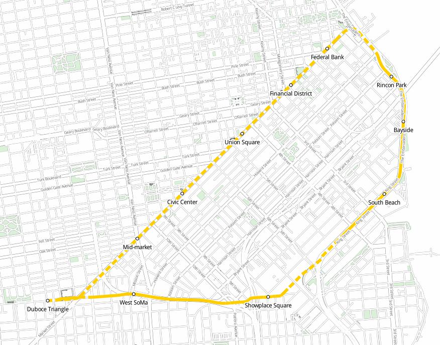
I actually created quite a fine level of detail in the source data, with some street connections removed to make room for the railway line, and level crossings on the remaining connections. While doing the final rendering I decided that less detail was better, putting emphasis on the line geometry and including muted street data only as context.
TileMill (which is a GUI wrapping Mapnik) is great for quickly producing somewhat-attractive renderings of geo-data. If I'd had more time it would've been fun to render the entire network in a geo-accurate way, but the OSM tools are of course not optimized for designing fictitious structures and so it was very time-consuming to tweak the placement of the line geometry.
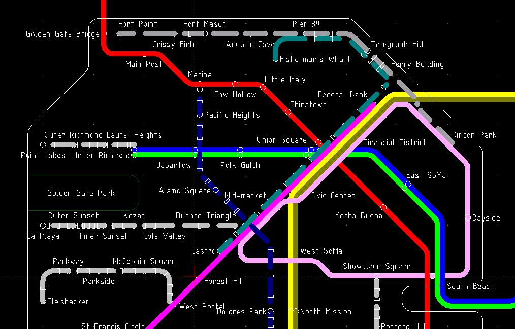
The overlapping lines near Duboce Triangle are unfortunate and resulted from my changing from precise rendering to rough sketch at the last moment. If I did this again I'd simplify the geometry to be at an appropriate level of detail for the rendering, in particular so that the overlapping dashed lines don't sum up to a messy-looking solid line.
The Article Itself
If I'm honest, my original motivation for this project was just that I wanted to try to draw a London-style rail network map. This project succeeded in that goal, but also caused me to learn a lot about various past and present rail proposals, many of which formed part of the network described in the article.
This article also represented an opportunity to try Medium, which showed itself to be a pretty capable and pleasant online publishing tool. I decided to use Medium for this article because its subject matter doesn't really fit with any of my existing online presences, but one disadvantage is that authoring there feels more like contributing to someone else's publication than creating something that is truly mine.
As a city planning proposal, I have no idea how practical any of my ideas are, since I am of course just an armchair urban planner. However, I hope that readers of the article come away with the idea that San Francisco and the broader bay area could have a much stronger public transit system if we were to put democratic will behind it, and it's likely to be necessary for San Francisco to successfully accommodate its growing population.